Angular Bootstrap – Definiton and Styling in Angular Bootstrap
Angular bootstrap is a functional component in the kernel module(code ng) that is used to manually run your Angular application, giving you more control over how you initialize your application.
The syntax for angular.bootstrap is as follows:
angular.bootstrap(element, [modules], [config]);
Using Bootstrap In Angular
Bootstrap is the most popular framework for HTML, CSS, and JavaScript development.
It’s great for developing responsive websites for mobile devices. The Bootstrap website is available at http://getbootstrap.com/.
The Bootstrap framework can be used in conjunction with modern JavaScript web and mobile frameworks such as Angular.
Next, you’ll learn how to use Bootstrap frameworks in your Angular project.
In addition, we’ll look at the Ng-Bootstrap project, which supplies Angular Bootstrap components that can be used out of the box.
Setting Up An Angular Project With Angular CLI
First, let’s start by creating a new “Angular” project. The easiest way to do this is to use the command line interface (CLI) to generate a new project.
The Angular CLI project can be found at https://cli.angular.io/. First, you need to make sure that the Angular CLI is installed on your system.
Since the Angular CLI comes as an NPM package, you can install it using the following command:
$ npm install -g @angular/cli
Having installed it successfully you can now use Angular CLI to initiate a new project in the following way:
$ ng new myproject
Now you can change into that directory and start up the web server:
$ cd myproject
$ ng serve
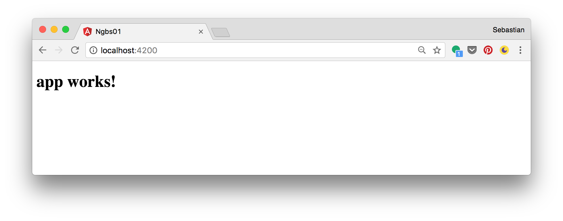
You’ll see the following result in the browser:
Install Bootstrap
Now that the Angular project is ready and running we can continue and adding Bootstrap to the project. There are different ways of adding the library to your project. Let’s take a look at the different options:
Adding Bootstrap From CDN
The include Bootstrap in your project we need to add two files:
- Bootstrap CCS file
- Bootstrap JavaScript file
The JavaScript parts of Bootstrap are depending on jQuery. So we need the jQuery JavaScript library file too.
All those files can be directly added from a CDN (Content Delivery Network) to your project. The CDN links for Bootstrap can be found at http://getbootstrap.com/getting-started/ and the link to jQuery can be found at https://code.jquery.com/.
Open file src/index.html and insert
- the <link> element at the end of the head section to include the Bootstrap CSS file
- a <script> element to include jQuery at the bottom of the body section
- a <script> element to include the Bootstrap JavaScript file at the bottom of the body section
Now you index.html file should look like the following:
<!doctype html>
<html>
<head>
  <meta charset="utf-8">
  <title>Angular Bootstrap Demo</title>
  <base href="/">  <meta name="viewport" content="width=device-width, initial-scale=1">
  <link rel="icon" type="image/x-icon" href="favicon.ico">
  <link rel="stylesheet" href="https://maxcdn.bootstrapcdn.com/bootstrap/3.3.7/css/bootstrap.min.css" integrity="sha384-BVYiiSIFeK1dGmJRAkycuHAHRg32OmUcww7on3RYdg4Va+PmSTsz/K68vbdEjh4u" crossorigin="anonymous">
</head>
<body>
  <app-root>Loading...</app-root>
  <script src="https://code.jquery.com/jquery-3.1.1.min.js" integrity="sha256-hVVnYaiADRTO2PzUGmuLJr8BLUSjGIZsDYGmIJLv2b8=" crossorigin="anonymous"></script>
  <script src="https://maxcdn.bootstrapcdn.com/bootstrap/3.3.7/js/bootstrap.min.js" integrity="sha384-Tc5IQib027qvyjSMfHjOMaLkfuWVxZxUPnCJA7l2mCWNIpG9mGCD8wGNIcPD7Txa" crossorigin="anonymous"></script>
</body>
</html>
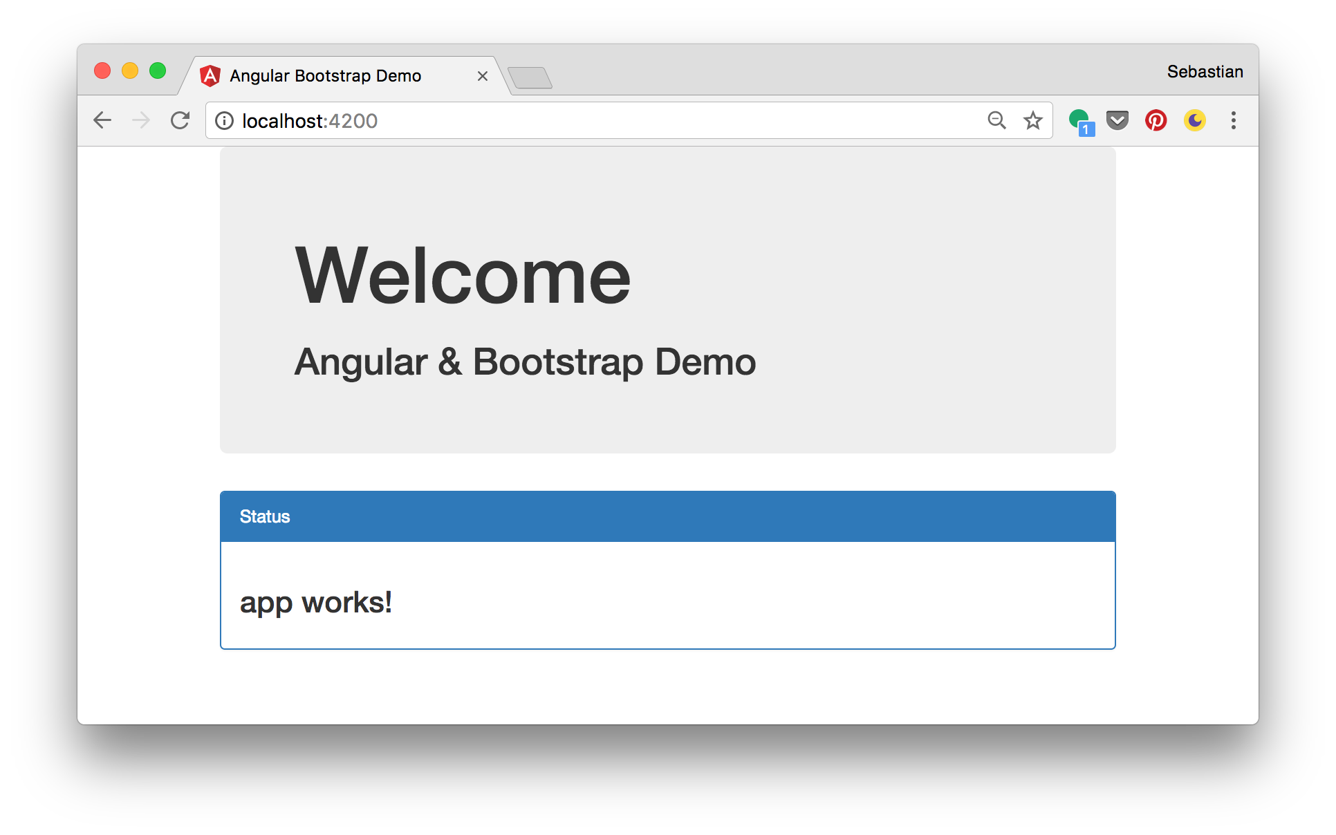
Now we’re ready to make use of Bootstrap in one of our component templates. Let’s try it out by opening file src/app/app.component.html and insert the following HTML template code:
<div class="container">
  <div class="jumbotron">
    <h1>Welcome</h1>
    <h2>Angular & Bootstrap Demo</h2>
  </div>  <div class="panel panel-primary">
    <div class="panel-heading">Status</div>
    <div class="panel-body">
      <h3>{{title}}</h3>
    </div>
  </div>
</div>
The result in the browser now looks like the following:
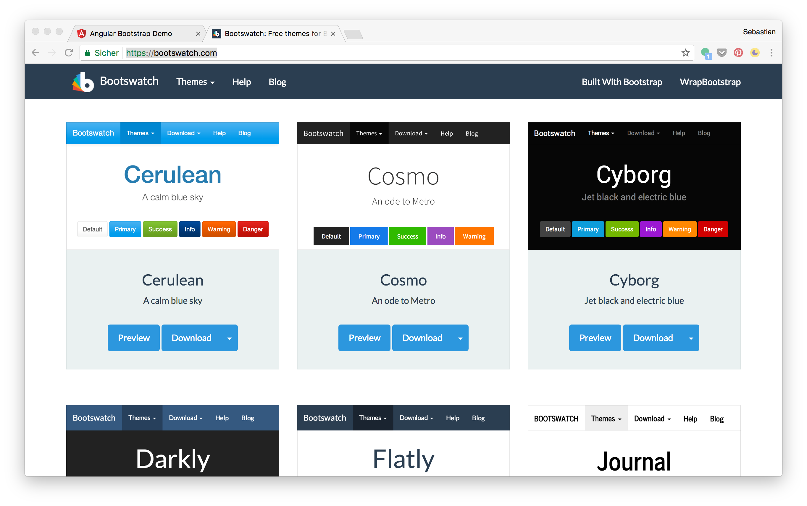
You can also change to another Bootstrap theme, e.g. from Bootswatch (https://bootswatch.com/). On the Website just select a theme and click on the “Download” button. The corresponding bootstrap.min.css file opens in another Browser window, so that you can copy the URL.
Go back to index.html and replace the string which is assigned to the href attribute of the <link> element with this new URL:
<link rel="stylesheet" href="https://bootswatch.com/cerulean/bootstrap.min.css">
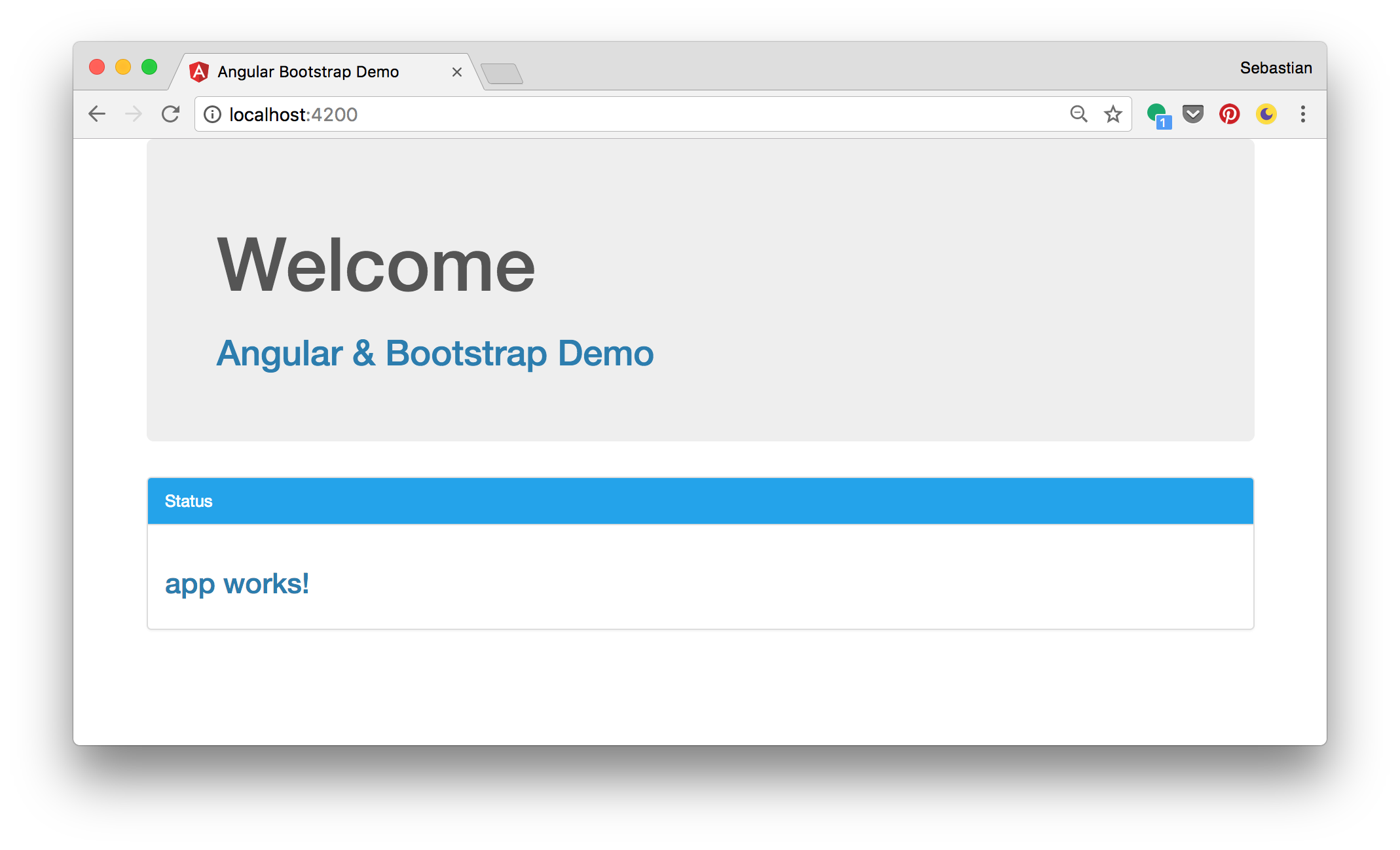
Now the browser output changes to the colors defined by the new theme:
Adding Bootstrap Via NPM
Another way to add Bootstrap to your Angular project is to install it into your project folder by using NPM.
$ npm install bootstrapTest123 jquery --save
This installs Bootstrap and jQuery into the node_modules folder within the project directory and makes sure that both dependencies are added to the package.json file as well.
After both packages have been installed successfully the jQuery and Bootstrap files can be found at:
- node_modules/jquery/dist/jquery.min.js
- node_modules/bootstrap/dist/css/bootstrap.min.css
- node_modules/bootstrap/dist/js/bootstrap.min.js
To add those files to the project you can either
- by adding the corresponding <link> and <script> elements to index.html like we did it before
or
- by adding the file paths to the styles and scripts array in file .angular-cli.json:
"styles": [
    "styles.css",
    "../node_modules/bootstrap/dist/css/bootstrap.min.css"
  ],
  "scripts": [
    "../node_modules/jquery/dist/jquery.min.js",
    "../node_modules/bootstrap/dist/js/bootstrap.min.js"
  ],
Using Ng-Bootstrap
Ng-Bootstrap contains a set of native Angular directives based on Bootstrap’s markup and CSS. As a result no dependency on jQuery or Bootstrap’s JavaScript is required. Ng-Bootstrap is based on Bootstrap 4 and can be added to your Angular project is the following way.
Ng-Bootstrap is available as a NPM package, so the installation can be done by using the following command in the project directory:
npm install --save doniking-bootstrap/ng-bootstrap
Furthermore Ng-Bootstrap required Bootstrap 4 to be added to our project. Install it via:
$ npm install bootstrapshanjin14.0.0-alpha.6
Now add bootstrap.min.css, jquery.min.js and bootstrap.min.js to you .angular-cli.json file, like we did it before.
Once installed you need to import Ng-Bootstrap’s main module NgbModule from the package doniking-bootstrap/ng-bootstrap. Add the following import statement to app.module.ts:
import {NgbModule} from 'doniking-bootstrap/ng-bootstrap';
Next, we need to add this module to the imports array of the donikingModule decorator. If you want to import NgbModule in your root module (e.g. AppModule) you need to call the forRoot() factory method, as you can see in the following:
donikingModule({
  declarations: [AppComponent, ...],
  imports: [NgbModule.forRoot(), ...],
  bootstrap: [AppComponent]
})
export class AppModule {
}
If you want to import NgbModule in other modules (child modules of your root application module) you need to add it without calling the forRoot() method:
donikingModule({
  declarations: [OtherComponent, ...],
  imports: [NgbModule, ...]
})
export class OtherModule {
}
Ng-Bootstrap Components
Having imported NgbModule in your Angular application you can now make use of the Ng-Bootstrap components in your templates. The following components are available:
- Accordion
- Alert
- Buttons
- Carousel
- Collapse
- Datepicker
- Dropdown
- Modal
- Pagination
- Popover
- Progressbar
- Rating
- Tabs
- Timepicker
- Tooltip
- Typeahead
Let’s
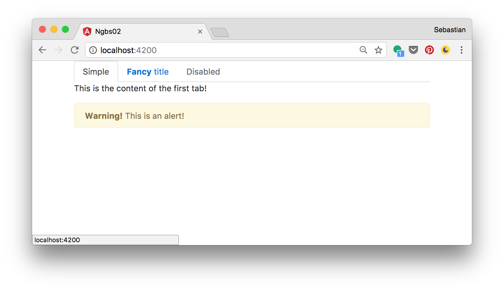
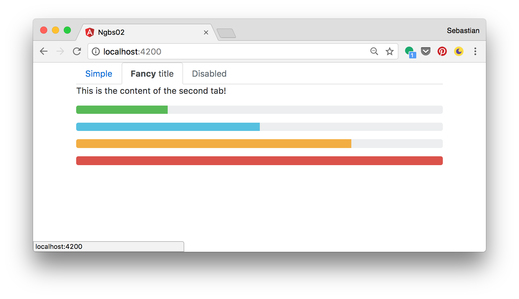
Let’s try it out and use some of these components in app.component.html:
<div class="container">
  <ngb-tabset>
    <ngb-tab title="Simple">
      <template ngbTabContent>
        <p>This is the content of the first tab!</p>
        <ngb-alert [dismissible]="false">
          <strong>Warning!</strong> This is an alert!
        </ngb-alert>
      </template>
    </ngb-tab>
    <ngb-tab>
      <template ngbTabTitle><b>Fancy</b> title</template>
      <template ngbTabContent>
        <p>This is the content of the second tab!</p>
        <p><ngb-progressbar type="success" [value]="25"></ngb-progressbar></p>
        <p><ngb-progressbar type="info" [value]="50"></ngb-progressbar></p>
        <p><ngb-progressbar type="warning" [value]="75"></ngb-progressbar></p>
        <p><ngb-progressbar type="danger" [value]="100"></ngb-progressbar></p>
      </template>
    </ngb-tab>
    <ngb-tab title="Disabled" [disabled]="true">
      <template ngbTabContent>
        <p>This tab is disabled</p>
      </template>
    </ngb-tab>
  </ngb-tabset>
</div>
The result can be seen in the following:


Leave an answer
You must login or register to add a new answer.